Our first feature post Covid is London based Sabrina Choi, who works in a variety of mediums and caught our eye in part becuase of the novel way that she presents two dimensional work online.
Acrylic and inked pen on cotton canvas
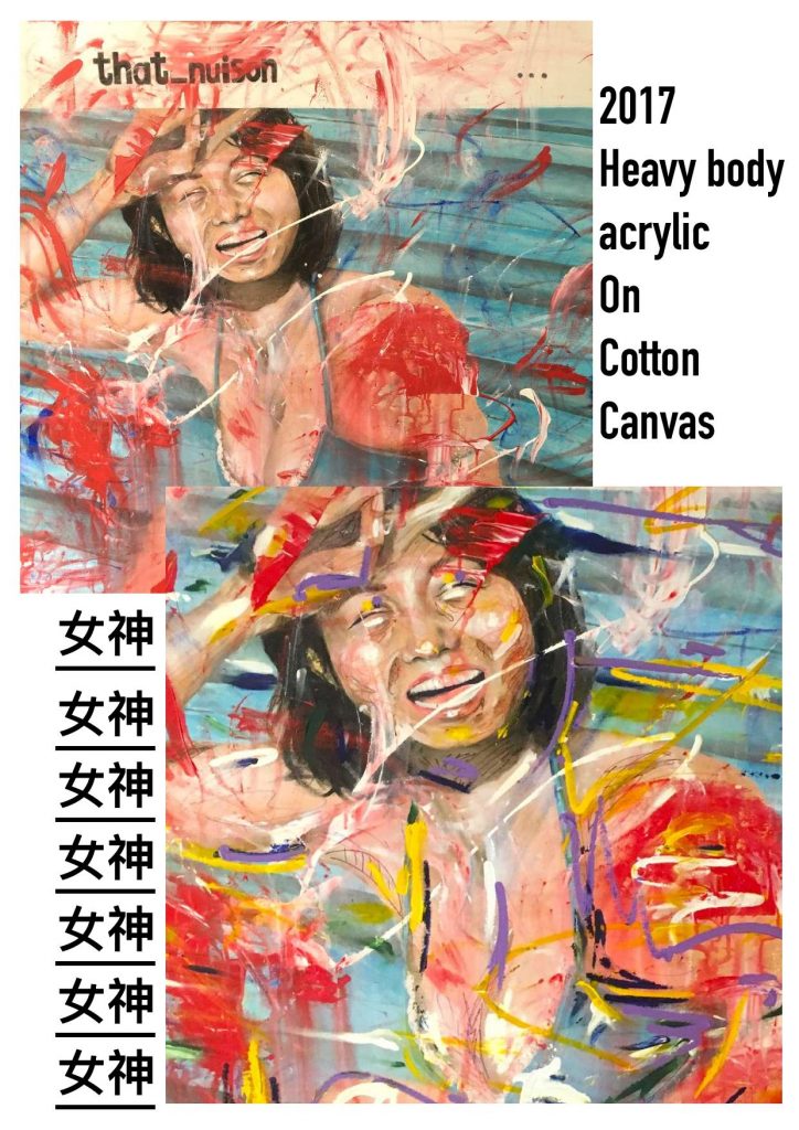
I was really struck by the presentation of the same painting in different edits, having been manipulated (presumably) in photoshop and then presented as the same work. I was wondering if you could expand a bit on how you see these different images, if one version is the “real one” or if there is a hierarchy? Your peice Nuison is one example.
A: In my portfolio, the first image of each project is what I considered as the original work, and the final representation of the image that been somewhat repainted or redesigned. I have the habit of putting a work aside for some time and coming back to it after months, just to see whether there’s anything I can do to elevate the painting itself, and ‘Nuison’ was the perfect example of that. No photoshop or any digital editing, just the good old splash of paint here and there to spice it up even more.
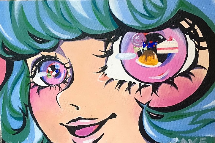
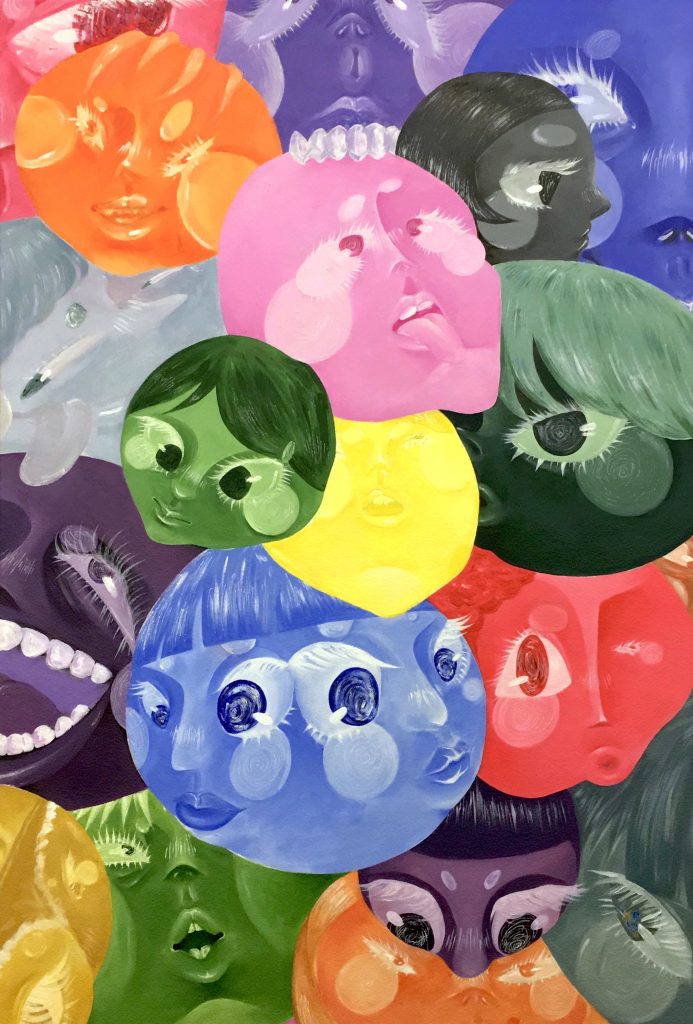
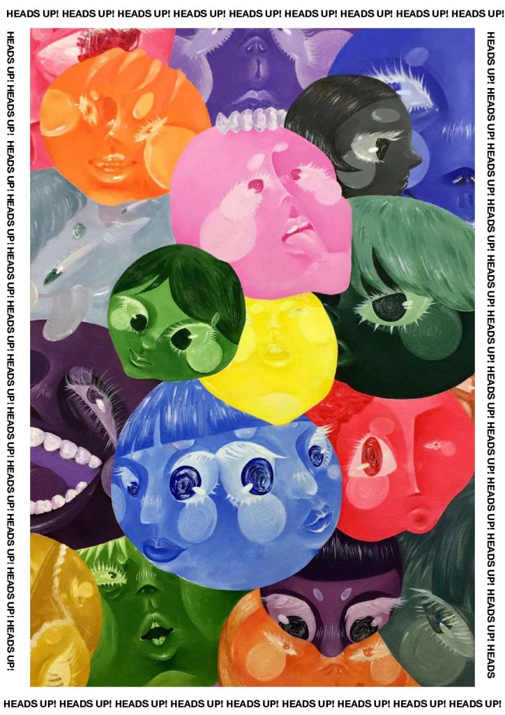
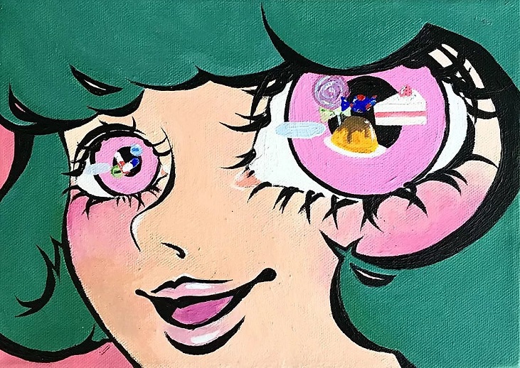
When I looked at, Binge, For example, it took me a second to find the differences, And then to think about why both are presented?
A: ’Binge’, in the other hand, was simply the first ‘draft’ and the refined version. As a perfectionist myself, I never know when to fully consider an artwork as ‘truly completed’, and that was shown in ‘Binge’. Personally I repainted ‘Binge’ to give the painting itself more depth while experimenting with the blend of pastel colours (e.g. shadows) as a dreamy and feminine touch , while the original version lives up the style when I started experimenting with this 2D superflat painting technique. I put both versions together, hoping to let the audience have a look and follow up with the thought process while I was making art.
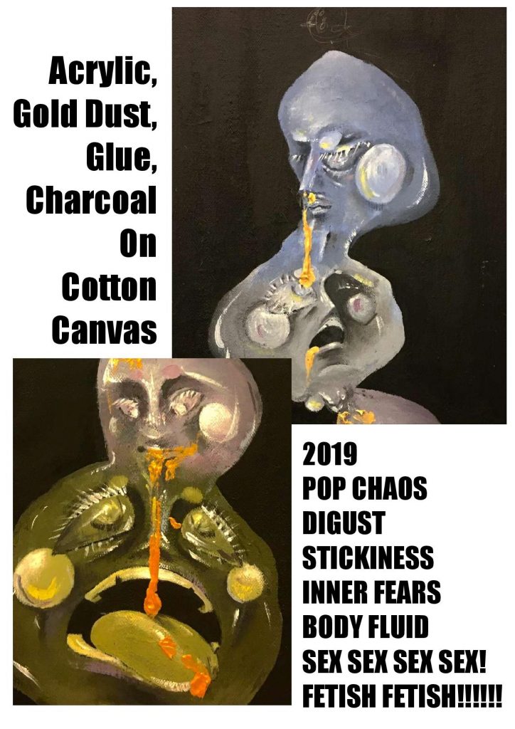
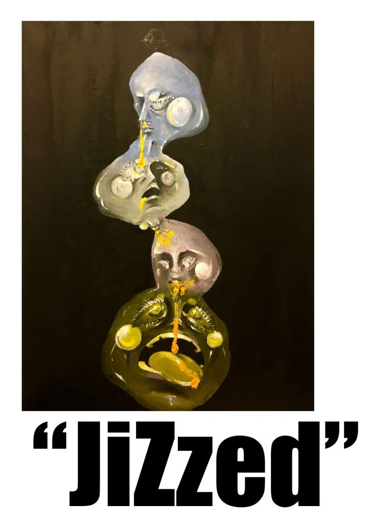
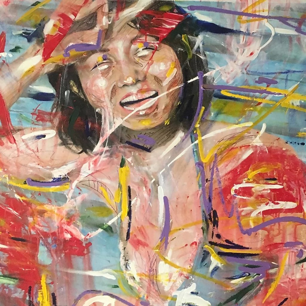
Could you tell us a bit about how scale factors into your work? You wrote that “Jizzed” for example, was originally a kind of maquette for a sculpture, but these divisions seem kind of subsumed into an online experience. Looking at “girls Girls Girls” the visible canvas tooth kind of blends into this different physicality that is specific to a computer screen, where these things that seem like imperfections in person are emphasized through photography.
A: Personally, I’ve never even thought of editing out the imperfections of my paintings, no matter what surface I was painting on or how ‘rough’ it looks. To me, imperfections, bits and cracks of each painting is what makes it more realistic and relatable to the audience, and I have always find myself being attracted to art that openly embraces small things like water patches and blending streaks. At least that was what I wanted while painting ‘Girls Girls Girls’ years ago, when I first entered Goldsmiths for my Foundation Course. ‘JiZzed’, on the other hand, was a completely different story. I was more experienced and confident when I painted this. Originally, it was supposed to just be a sketch on my notebook highlighting the key points of my ideal sculpture, yet when I saw this extra canvas in my studio space I couldn’t help but
think of what it would look like as a painting, where I will have even more freedom to express myself through colours that I’m familiar with. While I was planning out ways to present ‘JiZzed’ online, I really didn’t think too deep into anything. I simply wanted to show the audience the closest representation what the actual work is like in real life, and the only way to do it is to separated the art itself into different close up digital images, ignoring the flaws and textures that would be seen on the canvas and present it as it is. Nothing else, nothing too complicated, nothing too fancy.
I also was struck by how you incorporated text into the portfolio you sent us, that it sort of became a gestalt work, 2 dimensional artists sort of have to navigate how work is framed online, or if a portfolio should be framed as a print object, but you kind of sidestep that, could you maybe talk about that process? Curious also about your use of text in multiple languages, if this creates a barrier to perception, or functions as a kind of self selecting tool for the audience. Or if there are any signifiers that seem specific to living in london, any way your work reacts to living in the UK. Even though they are paintings, they have a relationship with comic books, or the text around the edge kind of reminds me of that old crust punk typography, like CRASS album covers for example.
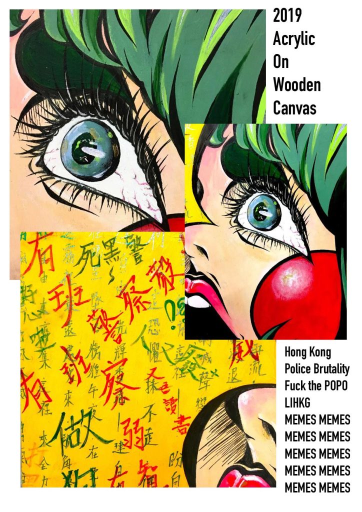
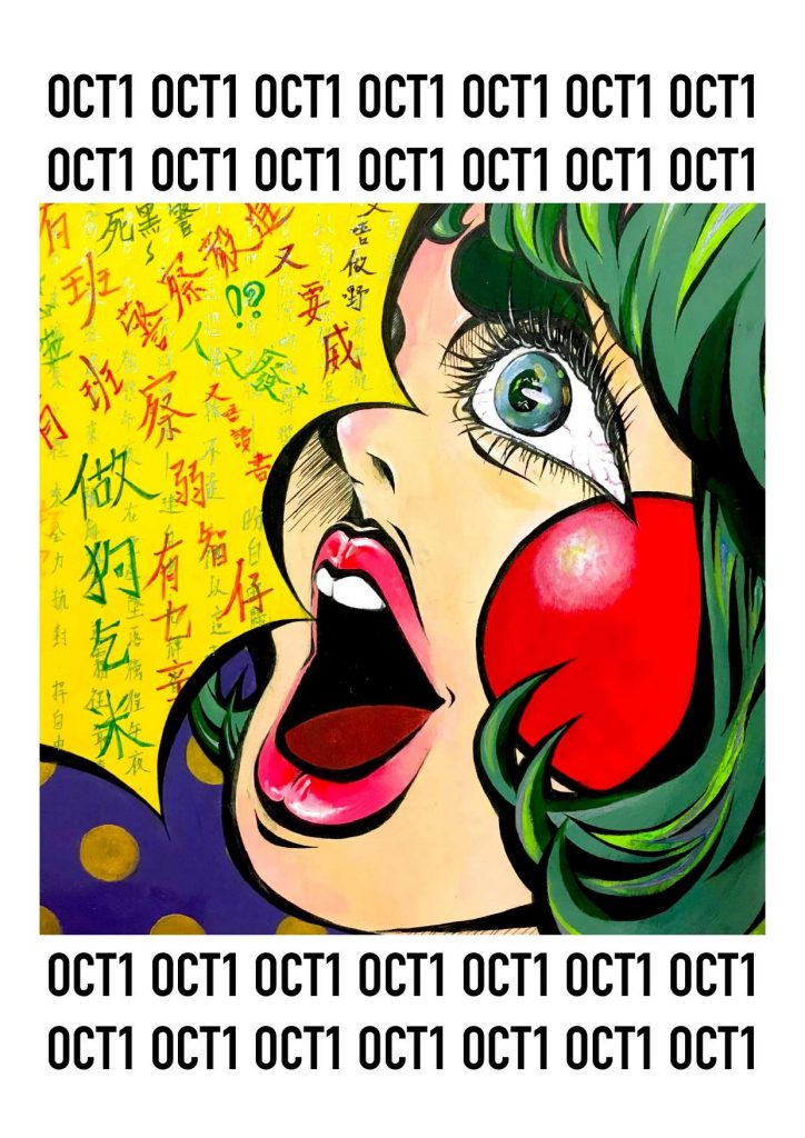
A: When I was working on my portfolio, the one thing that come into my mind was how will I be able to elevate the digital form of my artwork just so that it would catch the attention of others. Personally, I do not have a lot of experience with photo editing apps or anything, hence all I could use was my limited knowledge of Pages and make the most out of it. Being born and raised in Hong Kong and coming all the way to London to further pursue my studies, career and dreams certainly has a huge impact on me. Not only am I bilingual, but I’ve also learnt to embrace the beauty of the cantonese language, and I wanted to share it through my art. I included elements of my background and culture in both ‘Nuison’ and ‘Oct1”, hence Chinese Characters were used. Personally, I do not think that It is necessary for the audience to understand cantonese in order to fully appreciate the difference pieces, for I do believe that my work will be able to speak for themselves, emotion-wise. (Also, I enjoy giving the audience some space to let their imaginations go wild when it comes to experiencing my work. What’s the fun of making art when I’m the only one who is allowed to talk?) And yes, comic books does have a huge influence on my art. In fact, Japanese Comics (Manga) has always been one of the main reasons why I became interested in arts as a child. Also Pop Art and the SuperFlat Movement, which I’m sure is quite obvious in my paintings. But when it comes to design, not gonna lie, I just did what looks good to me, and tried my best to make it work.
Everything is closed right now, I was wondering if there were any really good shows you saw before the quarantine, or even better, if there were any exhibits that got cancelled that you were really looking forward to?
A: I was so excited for the upcoming exhibitions that were supposed to be held in spring/summer! I was really looking forward to the Andy Warhol and Yayoi Kusama exhibition in Tate Modern, and of course, Alice: Curiouser and the Curiouser exhibition in the Victoria and Albert Museum. Oh and the degree shows across London. I was so excited to see the works of graduate students this summer, just like the past few years, and learn a few things from them.
Or if you’d like to talk about how its disrupted your course or any of your personal exhibition plans. If youve been productive at all since everything went bonkers, what you feel the impact on your practice will be?
A: This term, Goldsmiths has officially decided to try online teaching, hence a lot of students have flown back to their respective countries. To be honest, I don’t think that online teaching will be anywhere similar to the teaching we’re used to, hence we cannot show our working progress to our tutors directly. Also, I was supposed to have my first solo exhibition in Cambridge, and sadly it got cancelled too. A lot of plans have been either postponed or cancelled and it was certainly upsetting and frustrating, but it’s definitely for the best. We’re living in a strange time right now, but I’m sure this period of time also give fellow artist time to come up with new ideas in our practice. Is there anyway we can help the world a little through art? Is there any way we can spread positivity or hope? That’s what I think about every day after I started my home studio work. Luckily, I’m a painter, so the lockdown has not stopped me from working, but from time to time I still miss working in the studio with other students while joking around day to day things.
Outside of work that you were hoping to see, would you tell us about an artist (could be painter or not, could be British or not) who you think is underrated? Someone from the past who you like who you feel like has either fallen out of fashion, or never got the due they were warranted?
A: There’s soooooo many underrated artist out there but please I really hope that more Asian artists will get the kind of exposure they truly deserved! Do check out artist like Hikari Shimoda, Jonathan Tsang and Roby Dwi Antono! They have been around since long time ago, and honestly deserve recognition all around the world, since they’re just crazy talented and managed
to blow my mind every time they produce something new.
Also as a last fun question, I was wondering if you would tell us about a guilty pleasure, something you like that you don’t think is very serious. Could be a TV show or Movie.
A: Anime! Personally I’m more of a comic (manga) fan, but there are just so so so many nice anime on Netflix right now that i’d highly recommend watching. As long as you like cartoons, don’t be afraid to give it a go! Try Naruto, Haikyuu, Fate: Stay Night etc., I promise you won’t regret it!
Interview by Ben Duax, 2020
Good stuff Sabrina. Love your work. Keep kicking ass!